Jocelyn Meall on designing A Clockwork Orange

We have just opened Othello - show three of four in our Everyman Company 2018 season. It marks an interesting point to reflect on the specific challenges, myself and co-designer Molly Lacey Davies, have faced in designing four such diverse shows to run in a repertory season.
The process began last July, hard on the heels of Company 2017, which we also designed along with Michael Vale.
The first consideration was the configuration of the auditorium. Both Gemma Bodinetz and Nick Bagnall were keen to continue working in the round, after what was felt to be a successful reimagining of the new Everyman auditorium last year. This gave us maximum performing space for the company shows, which can have the full company of 14 on stage at once, doing big choreographed numbers, and also maximum seating capacity.
The next major consideration was the need to be able to turn the shows round within a four hour technical crew call…quite a tall order!
After reading and rereading the script and having our initial instinctive responses, our next response is to the space. It is great to have the chance to build on the acquired knowledge gained during last year’s experience and be able to improve or find alternative solutions to some of the more awkward problems of the repertory season.

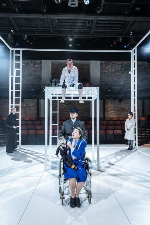
One of the most challenging problems this year has been designing A Clockwork Orange, which has such a sterile and sharp aesthetic. We felt a huge weight of expectation from both Burgess and Kubrick fans in terms of design.
This is where working collaboratively with Molly, last year’s LIPA design prize winner and this year’s winner Natalie Johnson, really comes to the fore. Having a second opinion, when faced with difficult options, can really speed up decision making. It can also really help having someone to bat ideas back and forth with. During a hugely useful R&D week working with Etta Murfitt on movement and choreography, the idea of a Droog fencing aesthetic was also sparked.
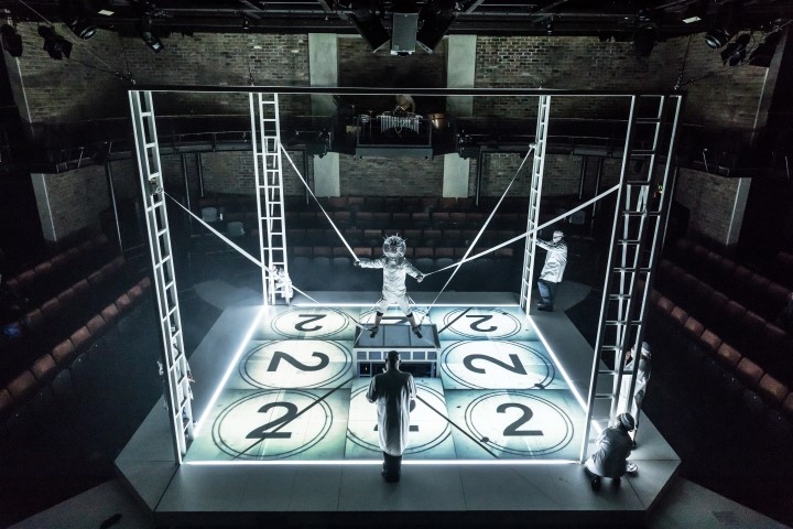
On A Clockwork Orange we went back to the novella for detail and inspiration, and tried hard to avoid the iconic images of the film. We wanted the auditorium to represent Alex’s universe, with him at the centre, very rarely leaving the space- including a gruelling 15 minute interval were George Caple, playing Alex, is left strung up eight foot in the air, mid way through the Ludovico aversion therapy. We really loved the Nadsat lingo and were inspired, by the term ‘ultraviolence’ to use UV light, like a visual play on words, for all the choreographed violence. The set and Droogs costumes were highlighted with Rosco Invisible Blue paint which seemed to add to the grotesque and macabre nature of what was taking place.
What we were aiming to achieve was a dynamic space for the actors to inhabit, incorporating trap doors, a slide to sub stage and four ladders were the droogs could literally elevate themselves.
After the huge contrast of Othello's wooden floor and muslin mosquito net, I couldn't wait to seeing Clockwork back in the room.
Posted in THE EVERYMAN COMPANY